

Color in the interior is a powerful tool that can change the perception of space, add coziness to it, or, conversely, make it more strict and elegant. However, it is important to remember that the wrong combination of colors can disrupt harmony and create discomfort. To create the perfect interior, you need to know the secrets of a successful color combination that will help you achieve the right atmosphere and emphasize the style of your home.
Understanding the color wheel and basic principles
To combine colors in the interior correctly, you need to understand the basic principles of color. The color wheel is a tool that helps you visually see how colors interact with each other. There are three main categories of colors on this circle:
- Primary (red, blue, yellow)
- Secondary (orange, green, purple)
- Tertiary (colors obtained by mixing primary and secondary colors)
There are several basic principles that should be followed when combining colors:
- Monochromaticism – the use of different shades of one color. This allows you to create a calm and harmonious interior.
- Complementary colors – a combination of opposite colors on a circle (for example, blue and orange). This combination creates a bright and contrasting interior.
- Analogous colors – using colors that are located next to each other on the circle (for example, yellow, orange, and red). These colors blend well and create smooth transitions.
- Triadic colors – using three colors that are equidistant from each other (for example, red, blue, and yellow). This creates bright but balanced combinations.
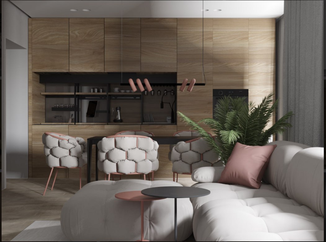
How to choose the main color for the interior
The choice of the main color depends on the atmosphere you want to create in the room. Consider how it affects the perception of space:
- Warm shades (red, orange, yellow): They create comfort, warmth, and stimulate activity. These colors are ideal for living rooms, kitchens, and dining rooms.
- Cool colors (blue, green, purple): These colors are calming and relaxing. They are suitable for bedrooms and bathrooms where a relaxing atmosphere is important.
- Neutral colors (white, gray, beige): Great for creating a base on which to add bright accents. Neutral colors provide versatility and are suitable for any room.
- The role of accent colors
Accent colors are those that attract attention in the interior. They can be bright and saturated, but it is important not to exaggerate so as not to overload the space. For example:
- Use bright accents in textiles (pillows, curtains, rugs), decor, or paintings.
- You can highlight one wall with a contrasting color, creating a focal point.
- It is important to remember that accent colors should not contradict the main color, but harmoniously complement it.
- Color and lighting
Room lighting has a strong influence on the perception of color. For example, bright and saturated shades can look darker in a room with poor lighting. It is important to consider:
- Natural light: Natural light makes colors appear brighter and more saturated. In rooms with good lighting, you can safely use more saturated colors.
- Artificial lighting: Warm light makes colors softer and more cozy, while cold light makes them more strict and modern.
- Examples of successful color combinations for different styles
- Scandinavian style: The Scandinavian interior is characterized by neutral and pastel colors: white, gray, light blue, mint. They create lightness and space.
- Classic style: Combinations of deep shades are popular in classic design: navy blue with gold, burgundy with beige, brown with cream. This combination emphasizes elegance and tradition.
- Loft: The loft style is characterized by contrasting combinations: black with red, gray with orange. The combination of industrial and warm shades helps to create coziness in modern interiors.
- Minimalism: In minimalism, monochrome combinations are usually used – white, gray, black. For accents, you can add one bright color, such as red or yellow.
- Psychology of color
Colors in the interior can affect our mood and behavior. Here are some examples of how different colors affect a person:
- Red: stimulates activity, stimulates appetite, suitable for living rooms or kitchens.
- Blue: calms, promotes concentration, suitable for offices and bedrooms.
- Green: associated with nature and harmony, helps to relax, ideal for bedrooms and bathrooms.
- Yellow: promotes a positive mood and creativity, well suited for workspaces.
Conclusion.
Creating harmony in the interior is an art that requires attention to every detail, including the right combination of colors. Using the basic principles of color, you can easily create an interior that will be pleasing to the eye, relaxing and inspiring. The main thing is to remember that colors should work together, maintain the atmosphere and complement the style of your space.
If you want your interior to be thoughtful and harmonious, it is better to turn to professional designers. BeeDesign studio will help you create a unique interior, taking into account your preferences and all the nuances.